On this page
I've spent more than ten years designing websites and products for B2B tech companies, and this autumn I noticed something odd while opening startup sites for teardowns: I could guess the font, the button color and the layout before the page finished loading. So I pulled the numbers to see whether it was just my feed, and it isn't. Below is the data, the fifteen giveaways buyers pick up on (the things people mean when they call a site vibe-coded), what it costs you, and a DESIGN.md template you can give to Lovable, v0, Cursor or Claude Code so the next page they build looks like your company and not like the average of the internet.
The short answer
- AI builders ship the most likely website, and in 2026 that's usually the same kit: Tailwind CSS, shadcn/ui components, Lucide icons, an Inter or Geist headline and an indigo button.
- shadcn/ui is on 123,921 sites in HTTP Archive's October 2026 crawl, up 192% in a year, while the number of sites tested fell 6.8%.
- Familiar layouts help first impressions. Borrowed claims, proof and visuals hurt: 58% of US consumers trust content less once they suspect AI made it.
- The fix is cheap next to a rebuild: a handful of brand decisions, a DESIGN.md your AI tool should follow, and real product and people instead of stock.
Why do AI-built websites all look the same?
AI builders generate the most likely answer to "make me a landing page", and the most likely answer is the average of the code they learned from. Anthropic calls this distributional convergence: without guidance, a model's landing page almost always lands on Inter, a purple gradient on white and minimal motion. The sameness comes from defaults stacked on defaults, so it shows up in every tool at once.
There are three layers of defaults, and each one pulls in the same direction.
The training data. For years Tailwind CSS was one of the most common styling choices in tutorials, starter templates and open-source projects, and Tailwind UI's example buttons were indigo. In August 2025 Tailwind's creator, Adam Wathan, joked on X that he wanted to formally apologize for making every Tailwind UI button bg-indigo-500, because now every AI-generated interface is indigo too. It was a joke, but the mechanism is plausible: if most example buttons a model sees are indigo, it has every reason to make yours indigo too.
The component kit. Many AI app builders and coding agents reach for the same open-source stack: React, Tailwind, shadcn/ui components (built on Radix primitives, or Base UI in newer projects) and Lucide icons. It's a good stack. It's also a stack with a very recognizable default theme, and when nobody changes the theme tokens, the result looks like the shadcn/ui docs.
The prompt. "Build a modern landing page for my AI startup" gives the model nothing to work with except the category. So it fills the gaps with the category's clichés: a centered hero, a pill above the headline, one word in a gradient, three feature cards, a logo strip, a stats row and a FAQ accordion.
Each layer is reasonable on its own, but together they produce the same website over and over.
What is AI slop design?
AI slop design is the name people now use for interfaces that look generated rather than designed: the Inter headline, the purple gradient, glass cards, three icon tiles and claims nobody checked. It's the visual cousin of AI slop text. The term is unkind, but it points at something real: a page where nobody made the decisions, so the defaults made them instead.
You'll also hear "vibe-coded website". That phrase describes how a site was made (by prompting an AI tool and accepting what it generates) rather than how it looks. Plenty of vibe-coded sites look considered, and plenty of hand-built ones look like slop. What buyers react to is the look of a page where no one decided anything, whatever tool produced it.
How common is the AI website look in 2026?
Very common, and still growing while HTTP Archive's sample shrinks. In HTTP Archive's October 2026 crawl, shadcn/ui shows up on 123,921 sites, nearly three times as many as a year earlier, while the total number of sites tested fell 6.8%. Tailwind CSS is now on 8.6% of all sites tested, more than double its share from October 2025.
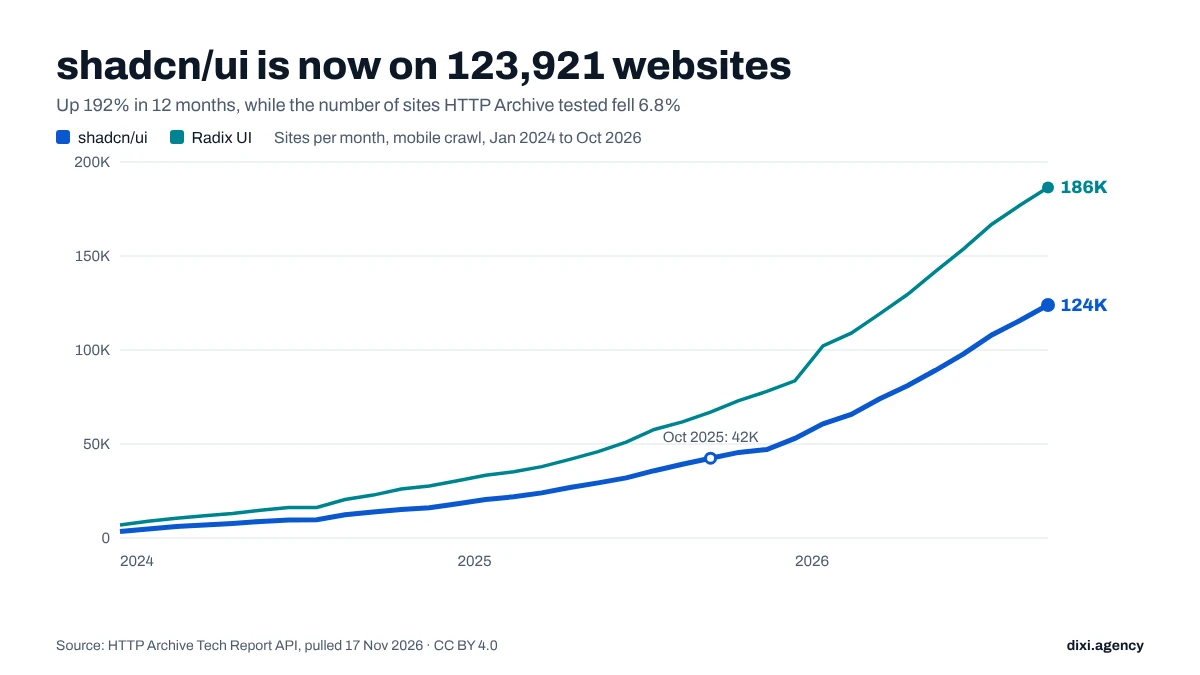
HTTP Archive tests millions of websites every month and records which technologies each one uses. I pulled the monthly counts for the pieces of the default AI stack that its detection rules can see.
| Technology (mobile, all sites) | Oct 2024 | Oct 2025 | Oct 2026 | Change in 12 months |
|---|---|---|---|---|
| shadcn/ui | 13,779 | 42,449 | 123,921 | +192% |
| Radix UI | 22,842 | 66,909 | 186,443 | +179% |
| Tailwind CSS | 218,990 | 352,365 | 729,436 | +107% |
| Lovable (detected) | n/a | n/a | 5,537 | +167% since Dec 2025 (peak 5,812 in Sep 2026) |
| All sites tested | 9,546,477 | 9,085,958 | 8,466,939 | -6.8% |
Source: HTTP Archive Tech Report API, mobile, all ranks, all countries; pulled by DIXI on 17 Nov 2026. "Lovable (detected)" only counts sites that still carry Lovable's own markers, so it is a floor, not an estimate of every Lovable site.
Two things stand out. First, shadcn/ui went from about 1 in 700 sites in October 2024 to about 1 in 68 today. Second, the kit spreads fastest outside the most-visited sites. In HTTP Archive's top-10k bucket (about 7,200 of the busiest sites were tested in October), Tailwind's share rose more slowly, from 7.3% to 9.1%, and shadcn/ui is on 53 of them (0.7%). My guess is that big companies have design teams that change the defaults, while startups and side projects ship the first thing that renders.
Adrian Krebs, an engineer who scored 1,590 recent Show HN launches against 16 AI design patterns in April 2026, found the same thing from the other direction: 22% of the sites carried four or more patterns and another 32% carried two or three. In his separate design slop report (about 500 sites), gradient heroes, the shadcn/ui signature and a centered hero in Inter or a generic sans were the most frequent patterns.
None of this means every Tailwind site looks the same. Tailwind and shadcn/ui are tools, and some of the most distinctive sites I know are built on them. The numbers show how many sites now start from the same place. What you change after that start is what makes the difference.
What are the giveaways of a vibe-coded or AI-generated website?
Buyers rarely name them, but they feel them in the first second. The giveaways are defaults nobody chose: an Inter headline centered under a pill badge, one gradient word, an indigo button, glowing blobs on a dark background, three identical icon cards, a bento grid, a stats row with round numbers and no source, and a headline that would fit any competitor.
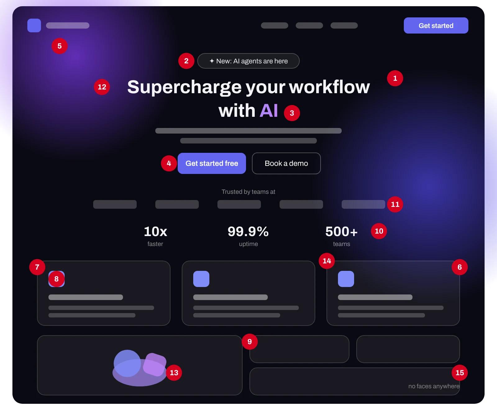
| # | The tell | Why AI picks it | What to do instead |
|---|---|---|---|
| 1 | Inter, Geist or a system sans on everything | Among the most common fonts in starter code | Choose a display face that fits your market; keep a clean text face for body copy |
| 2 | Centered hero with a pill badge above the H1 ("New", "Backed by...") | The most common hero in starter templates | Lead with what you sell and to whom; badges only for real news |
| 3 | One headline word in a gradient (or, newer, a serif italic) | Cheap way to add emphasis | Emphasize with copy, size or your brand color |
| 4 | Indigo or violet primary button, purple-to-blue gradients | Tailwind UI's indigo legacy | A brand color you picked on purpose, used for actions only |
| 5 | Dark background with glowing color blobs | Reads as "AI/dev tool" | Use dark only if your product lives in the dark (terminals, trading) |
| 6 | Frosted-glass cards (backdrop blur) | Looks premium in a screenshot | Solid surfaces with clear hierarchy |
| 7 | Three or six identical icon-on-top feature cards | Default "features" section | Show the product doing each job; cut to what buyers compare on |
| 8 | Library icons (Lucide) or emoji as the main visual language | Bundled with the kit | Product screenshots, diagrams or a custom icon style |
| 9 | A bento grid of tiles | Trendy pattern in the training set | Use it only when tiles really are equal; otherwise a sequence |
| 10 | Stats row with round numbers ("10x faster", "99.9%") and no source | Fills the layout slot | Customer results with names, dates and context |
| 11 | "Trusted by" logo marquee with no story behind it | Template default | Two or three named results beat twenty logos |
| 12 | A headline that would fit any competitor | Prompt only gave the category | Swap test: if a competitor's logo fits on it, rewrite it |
| 13 | Abstract 3D shapes or AI images instead of the product | Easy to generate | Real UI, real data, real people |
| 14 | The same corner radius on every element | One token, never changed | A radius scale that matches your brand's character |
| 15 | No human anywhere: no founder, no customer, no team | Nobody asked for one | A face, a name, a quote with a role |
One trap is worth naming. As "AI slop" became a meme, people started fixing it with the same handful of moves: a serif italic word inside an Inter headline, cream backgrounds, grain textures, Instrument Serif and Space Grotesk. Krebs already counts the serif accent word and those font combos as patterns. If you swap one default look for the next popular one, buyers will place you in the same pile six months later. The goal is a look that comes from your company, which means it has to start from decisions about your company.
Does looking AI-generated actually hurt conversion?
It depends on what looks generic. A familiar layout helps: Google's research found that sites people rate as typical for their category and visually simple win first impressions within 50 milliseconds. What hurts is a site that's indistinguishable in the parts that should be yours: the claim, the proof, the product and the people. That's where trust and memory are decided.
So there's a real nuance here, and it's the reason I don't tell founders to throw away their layout. In a 2012 study by researchers at the University of Basel and Google, websites with low visual complexity and high prototypicality (they look like what people expect for that kind of site) got the highest beauty ratings, and those judgments formed within 17 to 50 milliseconds. A familiar structure is a feature. Nobody wants to hunt for your pricing page.
The cost of looking generic shows up later, in three places.
Trust. In a Kinsta survey of 1,008 US consumers published in September 2026, 58% said they trust content less once they suspect it was AI-generated, and 61.1% said they associate the quality of a company's website with the quality of its products. In Pantheon's survey of 1,000 US adults fielded in June 2026, 92% said AI-generated content makes it harder to tell whether a website is legitimate, and 86% said they're far more skeptical of online brands than two years ago. A site that looks generic gives a skeptical visitor less reason to believe it's real.
Memory. B2B buyers compare vendors side by side, often long before they talk to anyone. 6sense's 2026 buyer research found that the vendor buyers favored before first contact won 82% of the time (more on that in our Conversion Gap series). If three vendors on a shortlist look the same, the buying group has nothing to remember you by except the price.
Credibility of the claims. When a stats row says "10x faster" in the same layout every AI demo uses, readers discount it. In our October study of 42 freshly funded SaaS homepages, only 10 first screens said both what the product is and who it's for, and only 4 offered a concrete outcome (the full study). Generic design and generic copy usually travel together.
There's also a quieter reason it matters in 2026. More of the first read of your site is done by AI agents and assistants, and they don't see your gradient at all. They read the text. If the visual identity is borrowed and the copy is vague, a person and an agent both come away with nothing specific. Our AI agent test found only 1 in 7 startup sites gave a buyer's agent everything it needed for a shortlist.
Is it a problem if my site was built with Lovable, v0, Cursor or Claude Code?
Usually not. The tool matters less than the defaults you leave unchanged. Vibe coding with an AI builder is a fast, sensible way to get a site live, and the same tools can produce a distinctive one if you give them brand decisions to follow. The issue is shipping the first output, because the first output is the average one, and the average one is the same for your competitors.
I'd rather a founder launch a plain AI-built site this month than wait three months for a perfect one. Speed matters at the seed stage. But there are two moments when the default look starts costing real money: when you raise and start selling to bigger buyers who compare vendors carefully, and when paid traffic starts landing on the page. At that point the site is doing sales work, and it should look like it belongs to someone.
If your app (not just your marketing site) was built with an AI tool, the code underneath may need attention too. That's a separate job, covered in our AI-built MVP cleanup guide.
How do I check if my website looks AI-generated?
Run three quick tests: count the default tells on your homepage, do a logo swap test on your headline, and show the page to someone outside your team for five seconds and ask what you sell and what makes you different. Five or more tells, a headline that fits a competitor, or a vague five-second answer means the look is doing less work than it should.
The Default-o-meter
Open your homepage in another tab and tick what you see. Weights reflect how much each giveaway costs in a B2B sale.
Tick what you see on your homepage.
Fix first- Tick what you see on your homepage.
0 to 4: yours · 5 to 9: familiar · 10+: template territory. Want a second opinion? Get a free teardown.
The swap test. Put a competitor's logo on top of your hero. If the headline, subheadline, image and button still make sense, the page isn't yours yet.
The five-second test. Show the homepage to someone who doesn't know your company for five seconds, then hide it. Ask what the company sells, who it's for, and one thing they remember. If the answer is "some AI tool, purple", you have your answer.
The squint test. Blur your eyes or zoom out to 25%. If the page is a centered block, three cards, a logo strip and a dark footer, it's the template shape. That's fine for structure. Then check whether anything inside it is unmistakably yours.
How do I make an AI-built website look like my brand?
Make a handful of brand decisions before you prompt again, write them down as tokens and rules, and make the AI follow them. The decisions that move the needle most are a positioning line, one typeface choice, a brand color that isn't a framework default, real product and people instead of stock, and proof with names. Most teams can do this in days, not months.
Unslop the hero
A typical AI-generated hero. Turn on the fixes one by one. The company is invented for this demo, and the proof card is a template, not a real result.
Supercharge your workflow with AIClaims review software for P&C insurance teams
The all-in-one platform to streamline operations and boost productivity.Adjusters see the policy, photos and prior claims on one screen, so a file can close in one sitting.
Giveaways left on this hero: 9 of 9
Here's the order I'd use.
- Write the sentence first. What you sell, to whom, and the outcome, in one line. If you can't write it, no font will save the page. Our homepage study has examples of first screens that do this well.
- Make one typeface decision. Pick a display face with some character that suits your buyers (a grotesk with personality, a slab, a serif for a regulated industry) and keep a highly readable text face. One deliberate choice is enough to break the Inter-everywhere look.
- Pick a brand color on purpose. Start from your market and your logo, not from a framework palette, and decide where it's allowed: buttons and key highlights only. Define it as a token so every generated component uses it.
- Show the product and the people. Replace abstract 3D shapes with real UI, real data and real faces: the founder, a customer, the team. This is the single biggest trust signal you can add, and an AI can't invent it.
- Turn claims into proof. Swap "10x faster" for a named customer, a number, a time frame and a source. One real result beats a row of round numbers.
- Choose one signature element. A shape, an illustration style, a way your diagrams look, a motion pattern. Something a buyer could recognize on a slide without your logo.
- Write it into a DESIGN.md and design tokens. Then reference it from the instructions file your AI tool always loads, so it reads your rules before generating anything. This is how you keep the next fifty pages consistent.
- Have a designer review the result. Even an hour of senior review catches the defaults that slipped back in.
What should a DESIGN.md for AI website builders include?
A DESIGN.md is a plain-text file of design rules that you point your AI coding tool to before it generates UI. It should name your positioning, audience and voice, your type and color tokens, a radius and spacing scale, image rules, component rules, copy and proof rules, and a short "never do" list. Tokens beat adjectives: "brand-primary #0B5D4B" works, "modern and clean" doesn't.
No tool reads a file called DESIGN.md on its own, so point to it from the file your tool always loads: project instructions or AGENTS.md in Lovable, CLAUDE.md in Claude Code, rules in Cursor, custom instructions in v0. Here's a template to start from. Copy it, fill in the brackets, and add one line to your prompt: "Read DESIGN.md first and follow it. Don't use any color, font or radius that isn't defined there."
# DESIGN.md: [Company]

## 1. Who we are
- One line: We sell [what] to [who] so they can [outcome].
- Buyers: [roles, company size, industry]. They compare us with [alternatives].
- Voice: [3 adjectives], never [3 adjectives]. Example headline we like: "[...]".

## 2. Type
- Display: [font name], weights [600/700], used for H1–H2 only.
- Text: [font name], 16–18px body, line-height 1.5–1.6.
- Never use Inter, Geist or a system font for headlines. No serif italic accent words.

## 3. Color tokens (only these)
- brand-primary: [#hex]  (buttons, links, key highlights only)
- brand-ink: [#hex]      (headlines and body text)
- surface: [#hex]  surface-alt: [#hex]  border: [#hex]
- accent: [#hex]          (charts and one highlight per screen)
- No indigo, violet or purple unless listed above. No gradients on text.
  Max one gradient per page, and only in [where].

## 4. Shape and space
- Radius: buttons [x]px, cards [y]px, inputs [z]px. Nothing else.
- Spacing scale: 4, 8, 12, 16, 24, 32, 48, 64, 96.
- Layout: left-aligned hero by default. Asymmetry is allowed.

## 5. Images and icons
- Real product UI with realistic data. Real photos of [founder/team/customers].
- No abstract 3D blobs, no AI-generated people, no stock handshakes.
- Icons: [custom set / library name] with [stroke width], used sparingly.

## 6. Components
- Buttons: primary (solid brand-primary), secondary (outline), text link. No others.
- Cards: [describe], no glass blur, no colored top borders.
- Feature sections: show the product doing the job, not icon + title + 2 lines.

## 7. Copy and proof
- Every number has a source, a customer name or a date.
- Headline formula: [what] for [who] + [concrete outcome].
- Swap test: if a competitor's logo fits, rewrite.

## 8. Never
- Centered hero with a pill badge by default
- Bento grids, stats rows with round numbers, logo marquees without results
- Emoji as icons, glowing blobs, frosted glass
- Any token not listed in this file

## 9. Before you ship
- Run the Default-o-meter. Score must be under 5.
- Five-second test with someone outside the team.
Should you fix it yourself, use a template, or hire a designer?
Fix it yourself if you have a clear positioning line and someone on the team with taste, because the DESIGN.md and a weekend are enough. Use a premium template if you need credibility fast and can live with sharing a look. Hire a designer when the site is doing real sales work, you're raising or selling upmarket, or you've tried twice and it still looks generic.
| Option | Good when | Watch out for | Rough cost |
|---|---|---|---|
| DIY with a DESIGN.md | Pre-seed, clear message, a founder with taste | Defaults creep back with every new prompt | Your time |
| Premium template + your tokens | You need a credible site this month | Popular templates become their own "look" | Template plus a few days |
| Freelance designer for brand + system | One clear deliverable, small scope | Hand-off to whoever builds it | See our agency vs freelancer guide |
| Studio for brand, system and site | Seed to Series B, paid traffic, enterprise buyers | Make sure they show results, not just shots | See published agency prices |
If you'd rather have a second pair of eyes first, we record a free 5-minute homepage teardown and tell you which tells cost you the most. When the fix is bigger, our Conversion Sprint redesigns the page that gets the most traffic in 3 to 4 weeks, and we also do brand identity and design systems that your team (or your AI tool) can build from.
FAQ
Why does AI always use purple gradients?
Because so much of the web code AI models learned from used Tailwind's indigo and purple examples. Tailwind UI's sample buttons were indigo for years, tutorials copied them, and models learned that indigo means "button". Without a brand color in the prompt or a design file, most builders fall back to it.
What font do AI website builders use by default?
Many generated sites use Inter or Geist, or a system sans-serif stack, because those are everywhere in the starter templates and docs the models learned from. Anthropic's November 2025 frontend design guidance lists Inter among the fonts to avoid when you want a distinctive result.
Is shadcn/ui bad for my website?
No. shadcn/ui is a solid, accessible component base and many well-designed sites use it. The problem is shipping it with its default theme, default radius and default colors. Change the tokens (type, color, radius, spacing) and the same components can look like your brand.
Does Google rank AI-generated websites lower?
Google says it rewards high-quality content however it's produced, and it doesn't list visual style among its ranking signals. Where AI-built sites lose is indirect: thin copy, missing proof, slow or script-heavy pages, and lower engagement from visitors who don't trust what they see.
What does "vibe-coded website" mean?
A vibe-coded website is one built mostly by describing it to an AI tool (Lovable, v0, Bolt, Cursor or Claude Code) and accepting what it generates, instead of designing and coding it by hand. The term describes the process. People use it as a criticism when the result keeps the tool's default look.
Is there a tool that detects AI-generated website design?
Roughly, yes. Adrian Krebs open-sourced design-slop-cop, which loads a site in a headless browser and checks it for 16 deterministic AI design patterns; he reports about 5 to 10% false positives. The Default-o-meter above is the manual version, weighted for how much each tell costs in a B2B sale.
Can I make Lovable, v0 or Claude Code follow my brand?
Usually, with some supervision. Lovable has project instructions and reads AGENTS.md or CLAUDE.md, Claude Code reads CLAUDE.md, Cursor has rules and v0 has custom instructions. Point those to a DESIGN.md with exact values, tell the tool to use only those values, and review the first pages carefully, because Lovable's own docs warn that instructions aren't always followed in long chats.
Do buyers really notice AI-generated design?
Some do. In Kinsta's September 2026 survey, 58% of US consumers said they trust content less once they suspect AI made it. And the look is common: Krebs found 54% of recent Show HN launches carried two or more common AI design patterns.
How long does it take to make an AI-built website look custom?
A founder with a clear message can fix the biggest tells in a few days with a DESIGN.md. A proper brand and design system for a funded startup usually takes a few weeks. A redesign of one high-traffic page, like our Conversion Sprint, takes 3 to 4 weeks.
Method and sources
HTTP Archive data. Monthly adoption counts from the HTTP Archive Tech Report API (/v1/adoption), mobile client, all countries, all ranks, January 2024 to October 2026, plus the Top 10k rank for October 2025 and October 2026. Technologies as detected by HTTP Archive's rules: shadcn/ui, Radix UI, Tailwind CSS and Lovable. Pulled 17 November 2026. Counts are origins, not pages. Detection can miss sites that removed a technology's markers, so all counts are floors. The full series is in our CSV: dixi-ai-default-stack-httparchive-2026.csv (CC BY 4.0).
- HTTP Archive, Tech Report API: adoption by technology (accessed 17 Nov 2026)
- Anthropic, "Improving frontend design through Skills", 12 Nov 2025
- Adam Wathan on X, 7 Aug 2025 (Tailwind UI indigo), as reported by AIbase
- Adrian Krebs, "Scoring Show HN submissions for AI design patterns", 20 Apr 2026
- Adrian Krebs, design slop report (about 500 sites)
- Adrian Krebs, design-slop-cop (open-source checker)
- Kinsta and Propeller Insights, AI discovery and trust survey, 1,008 US consumers, published 22 Sep 2026
- Pantheon and Dynata survey, 1,000 US adults, fielded June 2026 (Retail Customer Experience, 4 Aug 2026)
- Tuch, Presslaber, Stöcklin, Opwis and Bargas-Avila, "The role of visual complexity and prototypicality regarding first impression of websites", International Journal of Human-Computer Studies, 2012
- Google Search Central, "Google Search's guidance about AI-generated content", Feb 2023
- 6sense 2026 B2B buyer research, via DIXI's Conversion Gap Part 1
- DIXI, SaaS homepage best practices 2026 (42 startups)
- DIXI, Is your SaaS website ready for AI agents? (Nov 2026)
- DIXI dataset: adoption of the default AI-builder stack, Jan 2024 to Oct 2026 (CSV, CC BY 4.0)